
|
The world of non-commercial film and A-V |
Events Diary | Search | ||
| The Film and Video Institute | | ||||
Colours - part 2 |
||||||
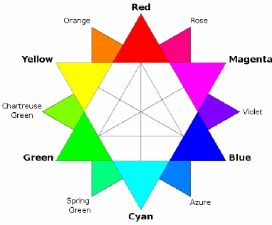
Colour WheelA practical way of picking colours, which do look right together, is to use a colour wheel. This image shows one suitable for computers: The colours on opposite sides of the wheel will look right together … thus here blue is the complement of yellow. Conversely Red and Orange (which are next to each other on this wheel) do tend to clash. This wheel only shows a small selection of the colours available. We tend to favour complimentary as a way of keeping the scheme simple and harmonious. However sometimes different shades of the same colour (a scheme known as mono) can look quite sophisticated. |
 |
|||||
| It is hard to visualise appropriate colours but fortunately,
there are many interactive online displays that do show you various colour
combination. One we like is
http://colorschemedesigner.com
which gives you a clear indication of what, for example, is meant by mono
or complimentary.
One final tip is keep your colour palette limited, 3 or 4 colours is usually enough for most pages - too many and it starts to detract from the design and look 'busy' |
||||||
The navigation menu |
||||||
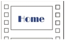
| Somewhere on each page you will have a navigation menu with
hyperlinks to all the key sections. As this, along with your logo, appears
on every page it is a crucial part of the design. At its simplest, you do
not of course have to have any design but merely a row of words:
Home Programme About Us News But this is not only boring but also is not likely to stand out amidst the rest of your excellent and impactful design. So at the very least consider putting them in a box with fill colour, maybe reverse it, give the edge some emphasis, or use a fancy font*. - see right ... Our advice is to look around at lots of sites and see what catches your eye but make sure that the colour scheme and design fits in with the rest of the colours you have chosen. |
||||||
|
||||||
| Clip-art websites are packed with fancy buttons you can use, but make
sure they fit your page colour scheme.
*Note that using fancy fonts will require you make your hyperlink as a graphic (a JPEG) to make sure that you get what you want -many computers do not have these fonts accessible to the browser. |
Other link shapes and designs can work:
|
|||||
|
The colour wheel diagram is by DanPMK on Wikipedia and used under
the Creative Commons Attribution-ShareAlike 3.0 License.
|
||||||
|
Website Makeover Guides - Introduction
What Should the Content Be? |
Navigation |
Planning Navigation
| Anchors & Links |
Words |
Getting Pictures |
Getting & Using
Pictures A Beginner's Guide to Creating a Club Website with Weebly
Don't Panic! |
Signing up to Weebly |
Making your first (elegant) page
| Adding more pages and
navigation |
||||||

Share your passions.
Share your stories.