
|
The world of non-commercial film and A-V |
Events Diary | Search | ||
| The Film and Video Institute | | ||||
Layout Fonts |
||||||||||||||||||||||||||||||
Fonts and stylesOne of the biggest faults I found with many of the club sites was lack of consistency. For example on the worst sites when it came to text there was an almost random allocation of colours, fonts both type and size both within a single page and between the various pages. Any properly laid out document (printed or on the web) attempts to have a set of simple rules to make it clear and easy on the eye of the reader. Your reader has absorbed these rules over many years of reading newspapers, magazines, and now websites and whilst you may not realise it if you break the rules the reader feels that something is not quite right. An example of what I mean is that for example the body text is always the same combination of attributes (font, colour, size etc.) on all the pages of the site so it always looks the same. The good news is that the need to be consistent with fonts and colours has been recognised as a requirement by web tools designers and they came up with a simple tool called CSS.
In practice, the 4/5 different situations which you make consistent on your
web pages might be as follows:
The way it works is very simple - here is an example: You have decided to specify that the Body text is always 'font - Verdena, size = 10, colour = dark blue' where as Paragraph headings are always 'font Arial, bold, size 13 in medium blue' and so on. Thus, every page follows the same convention and consequentially looks neat and professional. |
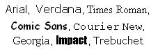
Choosing FontsSo you have the tools to help you be consistent but what font should you choose. Fonts used to be an esoteric subject only known about by the small community of typographers. Now we all seem to know tens of thousands of them. However, with a website, whilst you can set any font you like what people actually see depends on what fonts are loaded on to their PC. I discovered this as I wanted to use Broadway BT on our site but it would not display in the browser and we ended up as Arial which is nothing like it. It is generally accepted that you should use a safe list, as the following fonts will be found on virtually all computers:
If you want to use anything else, you can write out what you want in Word and then Frame grab it as an image and use that image instead. Of course, fonts have a very definite purpose - they do communicate a style - they do say something about your website and the organisation it represents. Even with this limited choice, there is a world of difference in say using
Times Roman is of course elegant but it does look a bit traditional on the other hand Comic Sans looks a bit quirky and Courier (unless you are trying replicate an old typewriter) just looks boring.
These may look impactful but should be used sparingly as otherwise they just look both heavy and OTT. Fonts can be divided into Serif and Sans Serif. Serif fonts (like Times Roman or Courier) have small strokes or lines that extend from the ends of letters and symbols. They can look like small feet, caps, tails, flags or dots. Because the lines make each character more distinct, serif text is easier to read. Serif fonts have been used for centuries in printed books, magazines, and newspapers. Sans serif fonts (like Arial or Verdana) are simple and straightforward, and lack the "lines" of the serif fonts. Because the individual characters of sans serif fonts are less distinct, they are harder to read. A lack of individual detail also gives them less personality. These fonts are typically used for newspaper headlines, photo captions and technical documents. Because computer screen resolutions vary, serif fonts can look blurred on many computers. The simplicity of sans serif fonts makes them easier to read on computers. They are the preferred choice for web site and PowerPoint presentations. To read more see www.pallasweb.com/fonts.html |
|||||||||||||||||||||||||||||
 |
||||||||||||||||||||||||||||||
|
||||||||||||||||||||||||||||||
Using logosYou could of course produce a completely anonymous website with just words may be some slabs of colour here and there and the name of the club written in 'characterless Arial' . But you want to inject some distinctiveness into the site.. To help do this your website should include a banner or logo to identify or brand your club. The aim of this is to make your website distinctive. This is important because like it or not people these days are influenced albeit in a subtle fashion by how things look and this includes websites. In my trawl around the IAC sites it was quite clear that this idea has been absorbed by some clubs but not necessarily executed very well and in some cases was almost certainly counter productive. |
||||||||||||||||||||||||||||||
|
|
|||||||||||||||||||||||||||||
| Using the logo on your site offers all kinds of opportunities to be creative in the website context - for example, maybe the logo should always be a hyperlink, which takes you back to the home page. The logo should be an integral part of the site design so that it is always in the same place with every page thus acting as a unifying link across all the pages. | ||||||||||||||||||||||||||||||
|
Website Makeover Guides - Introduction
What Should the Content Be? |
Navigation |
Planning Navigation
| Anchors & Links |
Words |
Getting Pictures |
Getting & Using
Pictures A Beginner's Guide to Creating a Club Website with Weebly
Don't Panic! |
Signing up to Weebly |
Making your first (elegant) page
| Adding more pages and
navigation |
||||||||||||||||||||||||||||||

 found more than one club with a design like this. Can you guess
why I do not like it - it is I think an old cine camera and if that
was not inappropriate enough (how many people will realise what it is or
see any relevance in 2010) it is also faint and fuzzy.
found more than one club with a design like this. Can you guess
why I do not like it - it is I think an old cine camera and if that
was not inappropriate enough (how many people will realise what it is or
see any relevance in 2010) it is also faint and fuzzy.
Share your passions.
Share your stories.